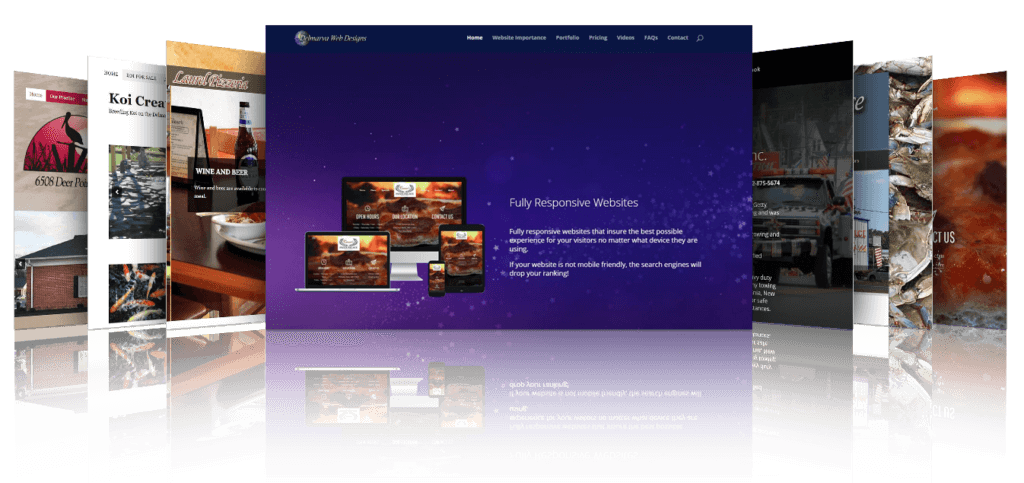
 My name is Bob Willoughby and I am Delmarva Web Designs. Whether you are here to start a new website, redo an existing site, or just learn a few things, I am here to help you! Hopefully you will learn some things about website design, function, and purposes. I hope to clear up some misconceptions and answer some questions about having a website that you may not have even thought of. I am assuming that since you are reading this you have already pulled your head out of the sand and know that everyone should have a website! And when you are ready, I would like to build a website for you.
Why do I need a website?
I was talking with a friend the other day and he said that he did not need a website, because he had too much business already? You are not going to build a website and suddenly have people standing in line at your business. I like to think of a website more as a service. A place where customers or potential customers can find out about you, what you offer, where you are located, and when you are open. The days of people opening up a phone book are gone. Just about everyone looks on the internet for answers to just about everything. And even though I do not claim to know everything, I can pretty much tell you that the internet is here to stay!
A website is too expensive!
 Websites are just like anything else. You can spend as much or as little as you want. You can get trash or treasure. I was talking with a young man working in my home and he said that he did not have a website because they cost thousands of dollars. I think that is a common misconception. You should be able to get a nice looking website for less than a thousand dollars for the first year. And it should be much less expensive the following years since most of the work is already finished. An ad in the Yellow Pages, in a newspaper, magazine, or other things will cost you hundreds of dollars a month and are not near as nice. A website can have color photos, music, video, and is easily updated. Do it once and it is there to stay with virtually zero maintenance. And a website is instantly accessible to anyone in the world! There is no comparison between those paper ads and having your own website on the internet!
I had another fellow over doing some work and he told me that he had a website. He was very excited and offered to show it to me. He had paid just over a thousand dollars for it. He gave me the address and I typed it in. He had a one page website with absolutely no website optimization. You would not be able to find his website unless you had the exact address and you typed it in correctly! It was basically worthless. The only thing that it might be good for was to put on his business cards so someone could see what services he offered. You want your website to get the most bang for the buck!
Oh no, I need another page! How much is that?
 Actually in today’s world most webmasters use a Content Management System (CMS). I use WordPress and XSitePro. With both systems once you get the basic system and design set up, adding a page is really easy. Just a few clicks and it matches the site and is integrated instantly! No charge! Where is that “Easy” button when you need it!
I can build a website myself.
I would not recommend that option unless you know a lot about it. There are many things about a website that you can not see or understand. You must understand a lot of other things and of course you will want your website to be found. It is not a case of “if you build it they will come”. You must have your website found by the search engines for the keywords that you target. There is a delicate balance of having your web pages optimized for the search engines and also for your visitors. Your webmaster should know about all of this and spend some time promoting your site and making sure that your customers find it.
The other thing is that you do not want to find your website being featured on this site: Web Pages That Suck in one of the “worst website” categories!
I need a fancy website that has flash and music.
The average internet user hates fancy and audio. Chances are if someone likes music, they already have their favorite playing when they get to your website. Imagine their frustration when they get to your site and have to try to figure out how to stop the music that you have playing! I am also sure that you have visited a site where they have the fancy flash beginning and a small button at the bottom that says “Skip Intro”. You would be surprised at how many people race to that button.
Today’s internet browsers are typically in a hurry. They want to see what they are looking for or they will hit the back button so fast it would make your head spin! And they do not want a confusing website. They want to see clean, simple and easy to navigate. If they have to search very hard for what they are looking for, they will just go somewhere else!
OK, I need a website. What is the next step?
 You are not alone. We will be working together as a team to build you a website that is good for the search engines, your visitors and you! I will be learning about your business and you will be learning about mine. Contact me and we will get you started. But there are some things that you should do before you contact me so that we will have a solid starting point. So get ready to start making some notes:
- What domain name do you want? That is simply the name that someone would type in to find you. Obviously your first choice should be the name of your company. And I prefer the .com versions. Unless you are nonprofit. Remember that we want to keep it simple. A name that is slightly different than your actual name may be confusing. Remember to look at your domain in all lower case letters with no spaces to insure that there are no surprises!
- Look at other websites, especially in the same field as you. See what types of websites there are and have a little vision of what you would like to see on your website. See what type of information and services they offer. Remember that we want to keep it simple. Easy to read and easy to navigate. A light color background with black letters is the easiest to read. And we will want to keep the number of colors down to no more than 4 colors that blend well. We don’t want a website that makes people think that the circus is in town!
- What are your expectations. Think about the purpose of your website and why people would want to come to it. Let’s give them what they want and a little extra.
- Keywords. This is the most important part of any website for any purpose. What will people type in the search engines when they are looking for what you have. I do have some tools that will help me find keywords that get the most searches and also give me an idea of whether we can compete for them. But obviously you will know more about your business than me. So I will need your help in that area.
- About you. A nice page about you will be very helpful. What is your “unique selling point”? Why should people believe or trust you? How long have you been doing it? You get the idea.
- Do you have artwork or logos? I have access to a lot of artwork, but YOUR artwork will be more impressive. If you have photos of your business, products, previous work, or employees, it makes your website a part of you. After all, a website is an extension of your business. It should look like it!
Hopefully I have answered some questions.
But feel free to contact me if you have any other questions or concerns. I hope that I can help you design and build a website that will give you the web presence that you need to keep up in today’s highly competitive world!
Enjoy the day,
![]()

