
Here are some of my websites.
Choose Moose Primitive Designs
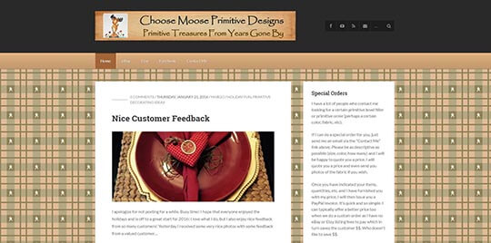
OK, shameless plug! This is my wife’s site. She makes and sells homemade crafts. It has that “primitive” look that the crafters are after. It helps to drive traffic to her Etsy and eBay stores.
Coastal Physical Therapy & Sports Medicine
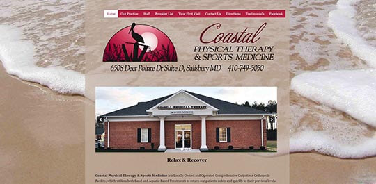
The theme of Coastal Physical Therapy & Sports Medicine is “Relax & Recover”. When you walk in the door you can feel it right away. The walls are a sand color, the staff is all smiles, and you can really feel it in the air. The logo was designed from a photo that Dr. Bails took himself. I decided to carry the logo feeling as well as the softer colors into the web design. This website feels like an extension of the theme that they are projecting.
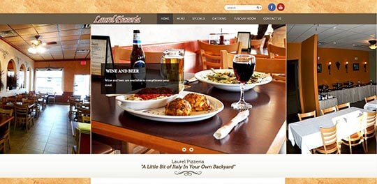
Right here in Laurel, Delaware! The colors are from their menu. They have a lot of faux techniques in the restaurant itself. Applying these 2 ideas over into the website really makes this site a part of the restaurant. Oh, and the food is good too! If you haven’t been there you are missing some really good meals.
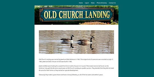
This is a “Members Only” site for the homeowners of Old Church Landing. They can access the phone directory and the news from anywhere!
The best part about being a web designer…….
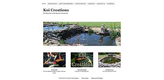
Meeting new people and seeing new things! I have never seen fish and fish ponds like Richard Laing has! I am amazed! Made me want to enlarge my own fish pond!
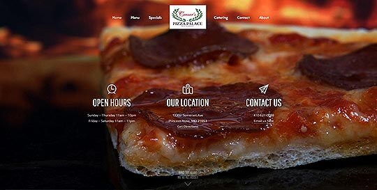
The thing about building websites for restaurants, is that you get very hungry while typing up the menu! LOL This is a great Italian Restaurant with a huge menu. Stop by and visit if you are in the Princess Anne area!
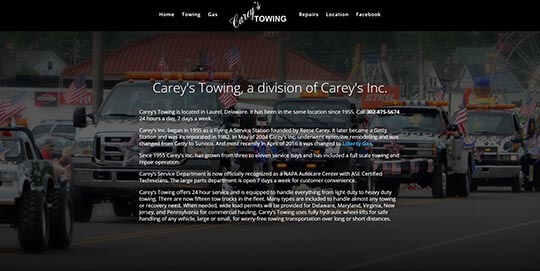
Carey’s Towing has been in business since 1955! Everybody in Laurel knows the Carey’s. Honest as the day is long. And more services than you can imagine. Still doing business the old fashion way! Visit their website!
Monarch Transportation Services
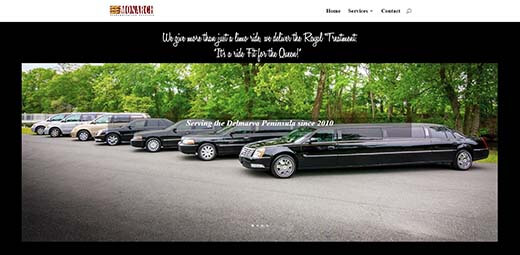
A local Laurel business serving transportation needs since 2010!
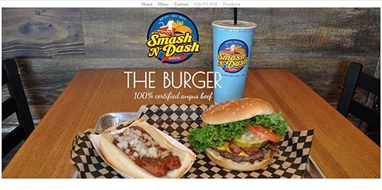
The same family that created Laurel Pizzeria did another amazing transformation. Smash Burgers are the newest craze. Stop by and try one!

New Tour Bus company in Laurel Delaware run by Irv Brumbley and Donald Haines.
Your Site Here!
Let’s get a website built for you and showcase it here!